Visual language is crucial when creating a brand identity, as well as delivering a consistent message to potential customers. Therefore, in order to find out the impact of visual language on sales, we first need to understand what the language really means in our lives.
According to Brian Nuckols, “Visual communication is an effective way to communicate ideas graphically and convey more content.”
Visuals also help stimulate feelings and better illustrate our intention.
So how do you harness the power of visual language to increase sales effectiveness? You will find out in the following article.

What is a visual language?
Since the dawn of time, man has been creating images. He tells his emotions in this way. From the first reflections of hands on a rock to the spread of painting based on linear perspective in the Renaissance, images created by most ancient cultures or illusionist painting in the Baroque, man tells emotions by imitating the real world – so he “sells” us his vision of the world. Human communicative activity has changed over the centuries, but it hasn’t changed all that much.
Visual language, therefore, is nothing more than a socially formed pictorial system of statement construction used in the process of communication.
But how drawn lines can express emotions and provide information?
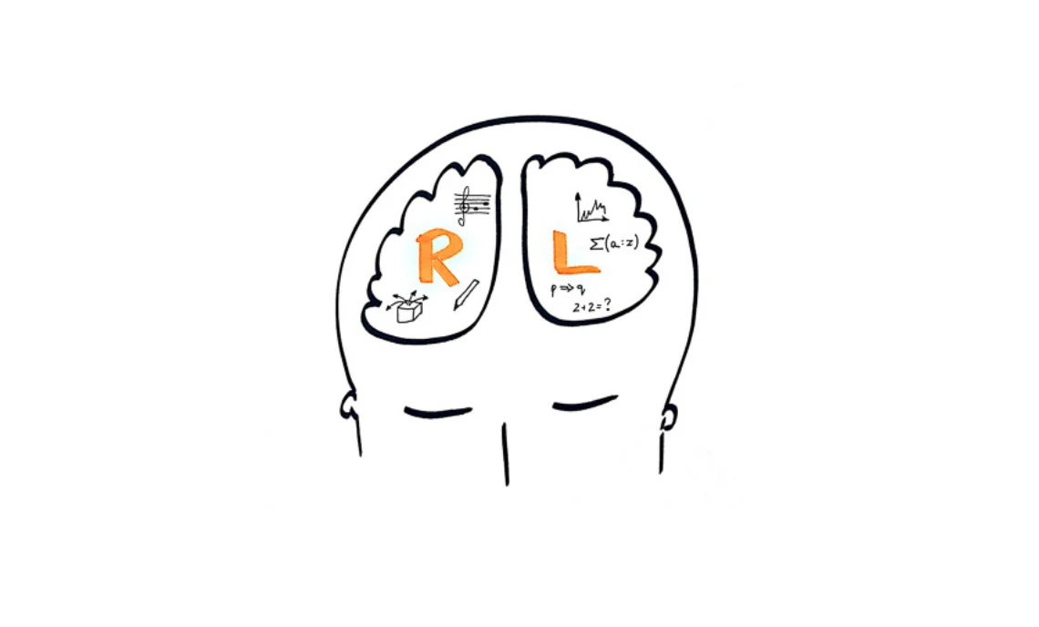
Image vs words
Specialists in neuroscience have proven that the right hemisphere of our brain is responsible for our general understanding of our environment and how to connect its various elements.
The left hemisphere, on the other hand, is responsible for processing information. What distinguishes it from the right is that it focuses on the foreground and details.
The tendency is that some of us use the right hemisphere more actively, while others use the left. If we engage one hemisphere of our brain more strongly over a long period of time, we will lead to a gradual reduction in the immediate perception of the other.
Hitting on a complex topic to communicate, which requires a holistic approach, we are doomed to make the mistake that the existing education system has programmed into us – we start explaining, that is, we multiply the amount of information already not absorbed by our audience.
The worst part of it all, however, is that our translation is mostly in verbal form.

What does this mean for communication?
If we want to reach all audiences, we need to include different communication channels in our message. After all, not all our audiences are the same. The important thing is that when we want to convey or present a certain amount of information – we have to use impulses for this purpose, which stimulate once one hemisphere of the brain, then the other.
Using visual language during a sales presentation causes the customer’s brain to start processing information in the form of an image. Thus, it does not have to focus all of its attention on the content being conveyed, as before.
Thanks to the use of visual language, our recipient’s attention is automatically focused, and information presented in the form of images is immediately remembered by him.
Visual communication vs challenges in sales
Despite the technological advances we are seeing today, the challenges of accurately communicating information in the sales process are slowing the growth of results. However, visual language helps us address three specific challenges, take the next step toward higher profits and gain in the eyes of customers.
Limited attention
At the very beginning, we have to face the gradual reduction of audience attention. Although a popular 2016 Microsoft study on how long a person can focus his or her attention before being distracted by an external stimulus turned out to be fabricated, we know full well that focusing a customer’s attention for longer is a growing problem. We have less and less time to do so.
Kahenman’s (1983) theory of attentional capacity suggests that people’s ability to focus attention is not static, but changes under the influence of factors such as task reward characteristics, arousal level, motivation and other biological determinants.
Simply put, perhaps the ability to focus attention depends on the type of task at hand and a set of external and internal factors.
Visual elements can effectively prevent customer distraction.

Competitiveness of the message
Companies must not forget for whom they create content. Often we find dozens of articles on company blogs, which are written in such specialized and complicated language that understanding them is a challenge for the reader, and sales presentations resemble Excel tables more than an attractive offer.
Our customers are flooded with content from competitors every day, and the user’s attention will be won by the one who puts the right image represent concepts or message with visual units in addition to words.
Are you creating an article or sales presentation on photovoltaics ? Include a complete image that illustrates a diagram of such an installation, and you will increase the chance that your potential customer will understand exactly what such an installation is and how it works. This will make him see the value of the solution you are offering faster, and your offer will prove more competitive for him than spoken words.

Memorizing information – how humans exchange information
Humans speak an average of 15,000 words a day. At least that’s according to a study by psychologist Matthias R. Mehl, published in the prestigious journal Science in 2007 . However, how much of the transmitted information is understood and remembered by our recipient?
As researchers from the Poznan University of Technology point out, we remember:
- 90 % of what we said about what we do,
- 70 % of what we said during the interview,
- 50 % of what we saw and heard,
- 30 % of what we saw,
- 20 % of what we heard,
- 10 % of what we read.
According to research, the greatest amount of external information reaches our brain and is encoded in it through the sense of sight. This is why so many people are “visual”. However, a simple procedure when creating a sales presentation is enough to make our audience remember 20% more.
If you add well-crafted visual units to your verbal message when talking to customers, potential customers will perceive your content as relevant and remember it.
Dual coding vs. successful sales
According to Allan Paivio’s dual coding theory, text is assimilated at different levels, in two separate systems. Paivio mentions a verbal system and a pictorial system. Accordingly, there are two cognitive systems. One is the verbal system and the other is the non-verbal (imaginal) system.
Both of these systems, although they exist simultaneously and are independent of each other, complement each other and generate a certain sense when reading.
When one system is activated, it automatically initiates the reactions of the other system. This creates an idea of the essence of the text being read, which may be different for each viewer. It is like when reading The Lord of the Rings, each of us imagined Bilbo Baggins’ hut differently.
The two systems support each other, and if certain information is forgotten in the verbal system, the pictorial system will help us extract the information we need.
Of course, there are greater opportunities to draw on the resources of both systems. This is where the huge opportunity for sales comes in. Information sent in two ways is complementary, and its encoding is simpler and more efficient. This happens when text and images work together to create unambiguous associations.
Precisely for this reason, sales presentations should stimulate both existing systems. Thus, an effective presentation must include both words and related images, which will help the potential customer remember and understand even better what the salesman wants to convey to him.

The pitfalls of visual language
Visual language is a very effective solution when we want our message to be well understood and remembered. However – when deciding to use such a form of communication – we must keep in mind the pitfalls that images hide.
The first is the limited flexibility of graphic materials. Compared to verbal language system, images are much less able to withstand editing. To change a graphic attached to an article published on a blog, it is most often necessary to remove the one originally uploaded and add the edited image again. This action unfortunately affects search engine ranking.
In addition to less flexibility, creating graphics, infographics and even images requires the right knowledge, budget and skills. You will need the right programs, training and equipment to create a dream images.
The last pitfall we mentioned would be succumbing to the temptation to rely solely on visual language. People love visual thinking. It is universal and easy to associate with a brand or product. However, even it can be distorted by our brains, and this will make everyone remember and process it in their own individual way. It is important, therefore, that visual communication is precise and combined with text or spoken words.
Perfect balance
A great example of the image trap was given by Christoph Niemann in the documentary “Abstract”. If, for example, we take the human heart and show it as it is – anatomically – the message will be completely incomprehensible, despite the representation of reality. If we decide to simplify it to a red pixel on a monitor screen then despite this simplification the message will also be incomprehensible.
Somewhere between this “pixel” and the anatomical shape of the organ, there is a symbol that is clear and understandable to everyone in the world – depicting the heart, love and affection. And our strong visual language must find that perfect balance.

How does strong visual language affect sales?
Sales work has largely not changed over the decades and it has the same nature – you still sell with words (explains, clarifies, justifies). If the salesman runs out of words – one reaches for paper (sketches). When that doesn’t help, brochures are left behind or dry presentations are sent, which – let’s agree – no one looks through or reads.
Operating only with words and text with no visual units causes the emotions associated with visual communication, which are responsible for the desire to have the item, to slip away. It also often makes the salesperson’s job ineffective, because the customer largely fails to understand a message built solely from words.
People don’t want descriptions, numbers or technical data. They want to see visible signs of what they are buying and feel the emotion – to see in a picture what they want and feel the excitement of buying and owning.
The lack of visual elements in the sales process greatly reduces the likelihood of convincing a potential customer to sign a contract, especially in industries such as automotive, photovoltaics and retail, where a physical product is sold. After all, none of us buys a winter jacket based solely on the description. We want to see it first, at least in a photo.

How to create and use a visual language
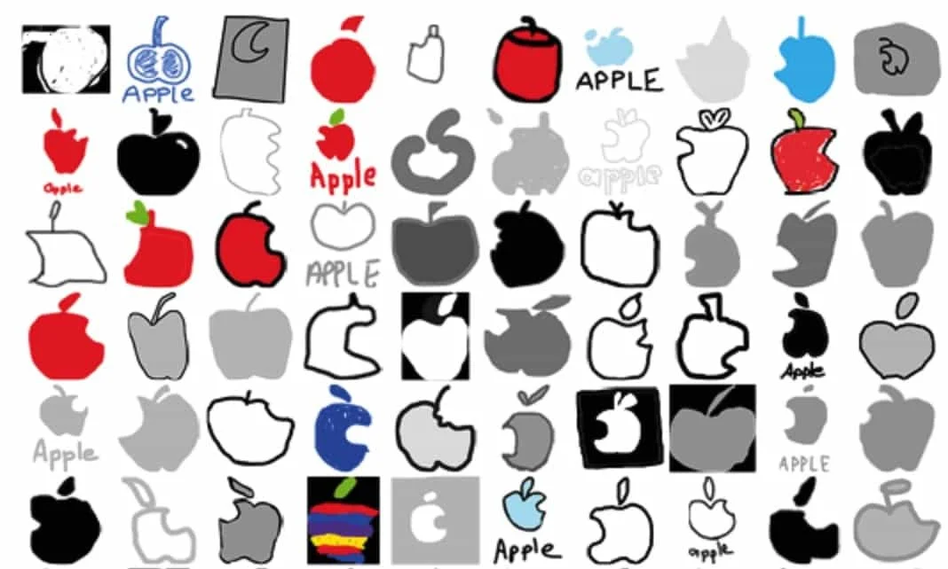
When thinking about introducing visual aspect in a company, you should first develop a plan of action. The visual language is designed to make our potential customers, when thinking of a new phone, immediately see with their eyes, for example, a bite-size apple.
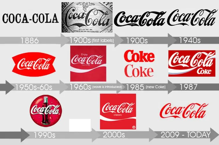
One of the most important features of a company’s visual system of communication using visual direction must be consistency. The result of work on this topic should be a corporate identity book, which will become the standard and basis for all visual design.
Below you will find the most important stages of designing a corporate identity for your company. Study them carefully, and the process of creating a corporate graphic language will go smoothly.
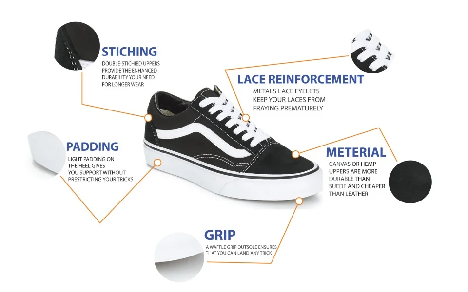
Understand the anatomy of your product
In order to operate effectively with visual language, it is necessary to carefully analyze what product or service you want to promote or explain with it. It is worth noting that many companies communicate visually, but do it wrong. Why? Probably because their visual design plan is nowhere near what they want to sell.
What needs to be done is to understand the anatomy of the product being offered. What problem does the product solve, what value does it provide, is it suitable for online sales, is it photogenic, against what background will it look good how popular is it in the market – these are questions you need to know the answer to before you plan a visual language for your company.
It will be hard to convince a customer to buy an organic apple if you present it against a laboratory background.
Know the anatomy of your product, otherwise your visual language will only result in burning through your budget or, worse, losing the image you have developed so far.
Understand how users perceive your brand’s visual language
Visual language represents the identity of your company. When working with graphics, you should have both the understanding who the product is aimed at and the purpose of the design. So you should spend enough time researching among customers and potential customers to get an authentic picture and complete image of the target audience.
This knowledge will help you determine the orientation of the entire project and the reusable visual units that will be best remembered, so they will not be fleeting memory images.
Define clear design principles
In order to avoid Sisyphean work and to avoid debating the same topics every time visuals are created, it is necessary to define the basic rules for creating graphic elements in marketing communications and sales materials.
Thus, an important element of the visual identity will be the so-called brand book or brand book, which will contain all the information on the developed visual standard. It should include information on fonts, colors, typography or distinctive graphics, which are to form a coherent whole, which is the visual identity.
Only after clear guidelines for the identity standard are established should your marketing department develop materials for salespeople, advertising spots and graphic elements for social media or email marketing.
Think of visual elements as a living organism
Spoken language modifies with age, as it is constantly influenced by different cultural currents. Visuals are exactly the same. Visual language is a set of non-static rules that are ingrained in a company and should be a growing ecosystem that evolves with products.
Ideally, our ecosystem should even adapt to a changing environment.
Document the process of creating the design language
When you are working on developing a visual language, always remember to keep proper documentation. Developed principles of visual elements are extremely important in the design of products and need to be described in detail, because often at the stage of brand guidelines for project implementation there are ambiguities.
Documentation completed during the development of the visual identity allows easier decision-making in the research phase and the whole design process of working on images, because each subsequent decision has a basis in a predetermined standard.
Stick to the set of rules
Consistency is key in visual language design. If you have managed to develop a visual thinking standard in your company, it is important to stick to it. Inconsistency is what makes visual languages and visible signs so difficult to build.
Often teams don’t follow their own instructions, making the visual language unclear and inconsistent for the viewer.
Remember, a visual language is useless if people (designers) don’t know how to speak it and how to express ideas with it.

How to use corporate identity language in sales materials?
Imagine that you are a customer and want to buy a tractor. Today you are to be visited by representatives of two competing companies whose products are virtually no different from each other. You are faced with a difficult choice.
During the meeting, the first one floods you with a torrent of words, tells you about the advantages of the product, shows you results in Excel and even written recommendations from satisfied customers. After the meeting, you realize that you actually don’t even know what their product is like and only remember that they process complaints within 120 days.
During the meeting, the second salesman shows you dream images of the tractors they have on offer. He also shows you a visualization of your dream tractor tailored to your expectations. He presents sales results and other important data in the form of aesthetically pleasing and easy-to-read graphs, and finally plays a video where satisfied customers show you how the equipment you bought performs in the field.
The choice has suddenly become much simpler, hasn’t it?
Here are some examples of how to use the power of visual language in sales.
Images
Studies have shown that the senses have an impact on memory retrieval. Using images that stimulate the sense of sight can help people retain or supplement the content conveyed in their mind.
Imagery can also help users better evaluating ideas and understand the information placed in the text, and also help the author avoid errors due to consumers’ individual perceptions of the topic. By adding an image to a text or verbal message, you leave less room for guesswork, but also increase the chance that your product or service or brand will be remembered.
Rankings
Another technique for using visual narrative is to display rankings in graphical form. Visualizing options grouped by criteria can significantly improve user experience and engagement. With rankings presented as an image, your potential customer is able to analyze the results that are most important to them in a few moments and capture your company’s successes.
Trends
If there is a trend in the market that is positively impacting your company’s image, use visual language to show your potential and current customers that your products are just on an upward wave and your brand is flowing in the right direction.
Storytelling
Data stories can be a valuable resource for many companies and has the same nature as e.g. rankings. And when turned using visual language into a graphically told story, they make excellent success stories for salespeople. Such examples will effectively appeal to the target market.
Presenting data through graphics or video is an ideal way to develop compelling stories that drive sales. Remember to watch for grammatical errors in the text and make sure your brand is visible.
Recommendations
Nothing convinces us to buy more than the opinions of other satisfied customers. The more good and varied reviews the better. Take advantage of the strong trend for video creation to show how your customers use your product and highlight its value.
Let others see and hear them speak positively about your service. This will definitely help you build a trustworthy brand image and sell more.
Contrasting juxtapositions
An effective way to present information is to visualize contrasting data. Comparative stories tell opposites and help to look at the story from both opposing but similar points of view.
Popular comparative tools commonly used in sales are profit and loss or advantage and disadvantage analyses.
Trying to convince a potential customer to make an important decision? Create an info-graphic comparing the pros and cons of a solution, or create an infographic showing your product against the competition.
How does Salesbook help use visual language in sales?
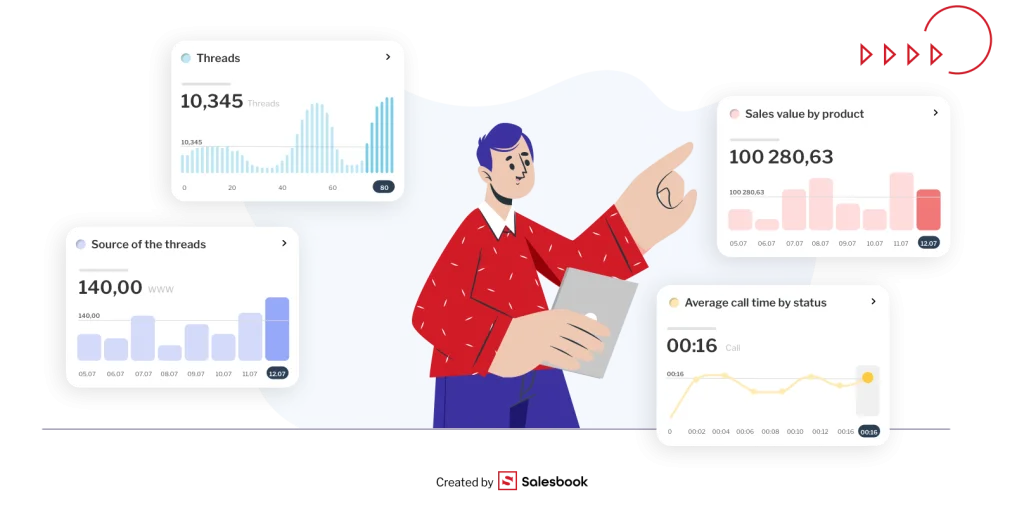
In Salesbook, we place a strong emphasis on visual language and “simplifying” complex concepts by showing them through images or intuitive models. We create a tool that allows a salesperson in a meeting to use images and video freely during a sales conversation with a customer.
This gives boring sales meetings a whole new dimension.
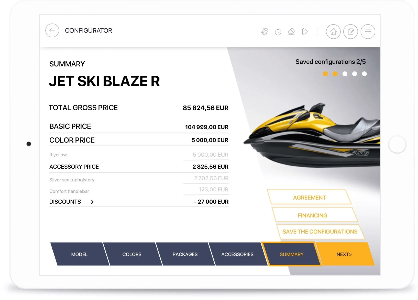
The salesman can freely present charts, images, recordings or even 3D models of the offered products in different configurations to best present the company and the proposed solutions.
Instead of telling a customer how photovoltaic panels will be arranged on the roof of his house, he can, thanks to the application’s built-in tools, prepare a 3D visualization of such a project on the spot.
Each of the visual elements presented during the meeting, such as diagrams, photos of past implementations, or different product variants, the salesman can attach to the created offer and send it to the customer as a summary of the meeting.
And this is only a small part of the Salesbook’s functions available to the salesperson.
Why invest in visual language?
Business is based on the principle: high results and good quality at the lowest possible cost. And it is precisely because ideas that translate into results are most quickly appreciated that visuals are so popular.
Visual language is a salesperson’s greatest ally these days. Never before have sales departments had so many tools and opportunities to show the advantages of the product on offer. Interactive presentations, product videos, 3D models, infographics and juxtapositions of competing offers – all of these are available today at your fingertips.
We live in a time where you buy with your eyes – so let the customer see and remember how many possibilities our product offers. Such an approach to sales guarantees increased effectiveness of salespeople and higher profits.
In overcrowded industries, visual language effectively builds brand recognition. All according to the principle of “stand out or perish”.
Make an appointment for a free demo and experience the capabilities of Salesbook!
If you want to learn about the best tool available on the market that uses your individual visual language in the sales process, be sure to schedule a free demo with our specialist and increase the effectiveness of your company’s sales meetings by 53%.
Table of Contents


