What is user experience (UX) design, and why is it so important in sales?

When you are reading this sentence, your brain is processing 100 mln bits of information. Do you know that you will focus on several words in this article and only for 8 seconds? Nowadays, when we are bombarded with numerous stimuli, it is hard to draw your client’s attention. User experience (UX) design can be very helpful. Read about how you can use UX in a sales process.
User experience (UX) design
User experience design is a term that refers to general impressions and subjective feelings that accompany a user who deals with various digital products, such as an e-commerce website or application used in sales.
Jacob Nielsen and Don Norman (a former Apple Computer employee), who established the Nielsen Norman Group, are believed to be pioneers in the area of user experience. Their aim was to focus on such concepts as user interface and user experience.
Their explanation of the term user experience is:
“User experience encompasses all aspects of the end-user’s interaction with the company, its services, and its products. The first requirement for an exemplary user experience is to meet the exact needs of the customer, without fuss or bother. Next comes simplicity and elegance that produce products that are a joy to own, a joy to use. True user experience goes far beyond giving customers what they say they want, or providing checklist features. In order to achieve high-quality user experience in a company’s offerings there must be a seamless merging of the services of multiple disciplines, including engineering, marketing, graphical and industrial design, and interface design”.
In practice, it means that a good UX designer who deals with website user experience should have knowledge of IT, human-system interaction, psychology, sociology, or even industrial design.

However, companies that want to meet customers’ needs, must have a broader perspective and come up with user experience strategies. Many engineers have found out that they have to take people’s needs into consideration.
What do Leonardo da Vinci and user experience have in common?
Leonardo da Vinci was not only a painter and an artist but also an engineer and a discoverer. Agnieszka Szóstek, the Polish UX designer, CEO of UXPlus, and lecturer at SWPS University, in an interview with “The Story Journal”, describes that da Vinci was asked to design a kitchen in a palace of Ludovico Sforza, a prince of Milan.
Before Leonardo da Vinci designed the kitchen he had observed the everyday work of servants. He applied the user-centered design process, but he did not know about this name. He wanted to obtain a well-thought-out project and a kitchen that would suit the needs of a cook and servants.
What do Leonardo da Vinci and user experience have in common? We can say that Leonardo da Vinci was a UX designer of his time.
Who is a UX designer?
A user experience designer (UX designer) is a person responsible for the entire process of obtaining a digital product and designing everything that affects a user’s interaction with it. The UX designer takes users’ needs and expectations into consideration and takes care of different aspects such as design, usability, and function.
UX designers mold products and services that people use every day. They define “user flow” – these are the steps made by the user to use a digital product.

Moreover, UX designers gather information, analyze data, and do usability tests.
Sometimes terms “usability testing” and “user testing” are used interchangeably. However, some experts point out that “user testing” suggests that a user is tested, which is of course wrong because UX designers test a given digital product.
Usability tests allow UX designers to identify problems, improve solutions and get to know users’ preferences and behavior. Thanks to this, UX designers create digital products that are intuitive and easy to use.
However, they not only use their UX design skills but also cooperate with other important specialists such as programmers, graphic designers, and interaction designers. They have to possess interpersonal skills, be open-minded and use critical thinking. UX professionals are involved in the day-to-day process of meeting end-user expectations.
The design thinking process
“No product is an island. A product is more than the product. It is a cohesive, integrated set of experiences. Think through all of the stages of a product or service – from initial intentions through final reflections, from the first usage to help, service, and maintenance. Make them all work together seamlessly ”– said Don Norman, and it is hard not to agree with him.
UX requires a deep understanding of users’ emotions and needs. Therefore, UX designers follow the design thinking process that according to Stanford’s school, includes 5 steps:
- empathize – understanding of users and their needs,
- define – describing identified problems,
- idea – being creative and noting ideas,
- prototype – creating solutions,
- test – checking if solutions meet users’ expectations.
If users find value in this particular product, the next step is its implementation.
The design thinking process is an important part of UX design which is often confused with UI design. The difference between the two concepts needs further explanation.
What is user interface?
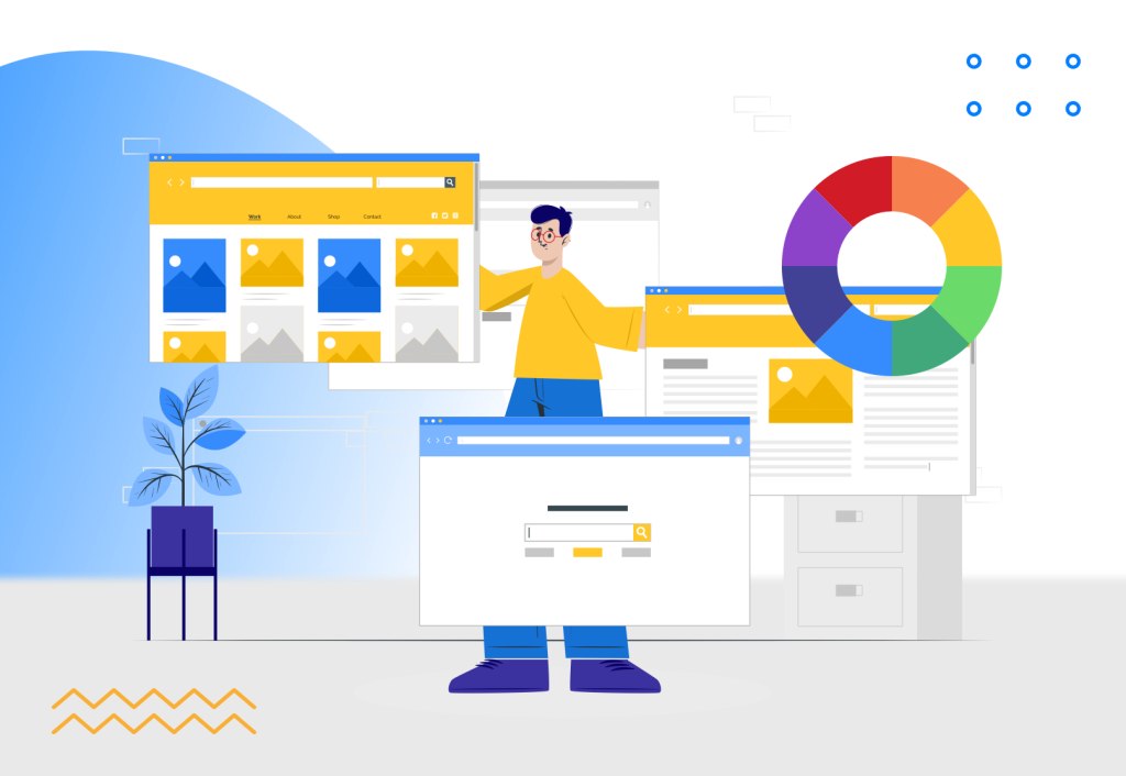
Very often the role of a UX designer is confused with the role of a UI designer. However, it is UI design that encompasses layout, placement of pictures, menu, graphic design, and information architecture.
UI design is an acronym for “User interface Design”. It deals with all elements of websites, applications, and other computerized devices that allow end users to have a physical interaction with a system. Why is that so relevant?
UX design is about technical issues and how a user interacts with a digital product, whereas UI design takes into account many other aspects, for example, visual design.
A good example is an online shop in which customers can focus on looking at products and buying them. The shop must have a logical structure, be intuitive, and be very detailed. It affects the overall user experience.
UX designers and user-centered design
User experience covers how people interact with digital products and how those products can satisfy their needs. UX design and UI design are inspired by user-centered design. It is an approach to the design process that puts the user’s needs and goals in the center and regards them as the most important ones.
User-centered design tries to find answers to the following questions:
- Who is a user? What is important to them?
- What are the goals of a user?
- How does a user complete tasks, and in what order?
- What are the conditions for a user to achieve their goal?
- What problems does a user have?
- What are the expectations for our solution?
What are the components of UX design?
UX designers start their work from understanding people’s problems and needs not without a reason.
As we have mentioned, UX and UI design consists of the following elements:
- market research, UX research, or user research,
- task analysis
- information architecture,
- strategy,
- content design,
- user interface design,
- interaction design,
- usability testing.
However, UX designers have to take also other factors into account. Obviously, they have to understand the target of a given product and create an adequate product or service. Happy customers will become loyal customers in the future. On the other hand, they have to keep in mind the expectations of a business environment that hires them.
User experience design and Peter Morville’s UX honeycomb
UX design is a very complex process. As we have said, it considers a given person’s perceptions and emotions. However, there are many more different aspects that UX design has to include. Peter Morville, an expert in information architecture (AI) and UX, created a honeycomb with the most important adjectives describing the usability of products.
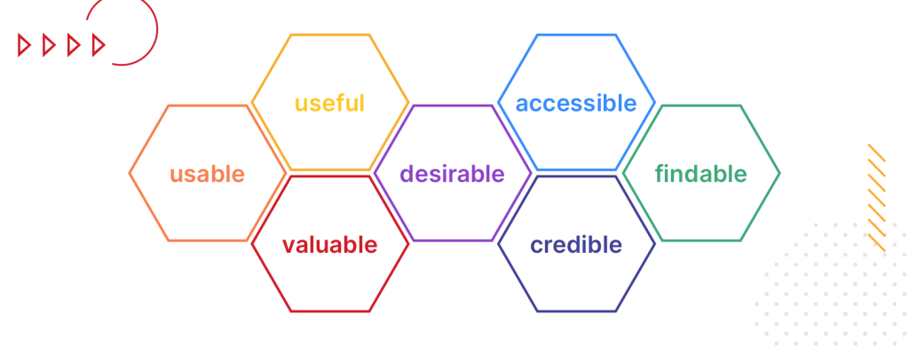
Morville distinguishes the following features of good UX design and a well-design digital product:
- Usable – a product has to be easy to use, users should use it without problems.
- Useful – a product has to serve some purpose and fulfill users’ needs.
- Desirable – a product has to be visually attractive, users should want to buy it.
- Findable – a product has to have a well-designed information architecture, users should find information without problems.
- Accessible – a product should be appropriate for people with disabilities
- Credible – a product is trustworthy and users are not afraid of using it.
- Valuable – a product should be profitable and keep investors happy.

What about your impressions? Do you have your favorite websites? Do they meet the criteria mentioned above? Think about it and then look at user experience from your customer’s perspective.
Is a system of selling products or services in your company designed by a UX professional? Does it take human factors into account? Is it easy to use? What about the architecture of information and visual design? How much do you care about user experience?
What do sales and user experience have in common?
Now you know such terms as user research, user experience, or UX design. However, what do they have in common with sales? You should be aware of several trends to understand the expectations of your customers.
Firstly, people do not like to read a lot of text on websites. They have time to read only 28% of words. What is surprising, it is more likely that they read 20% of words.
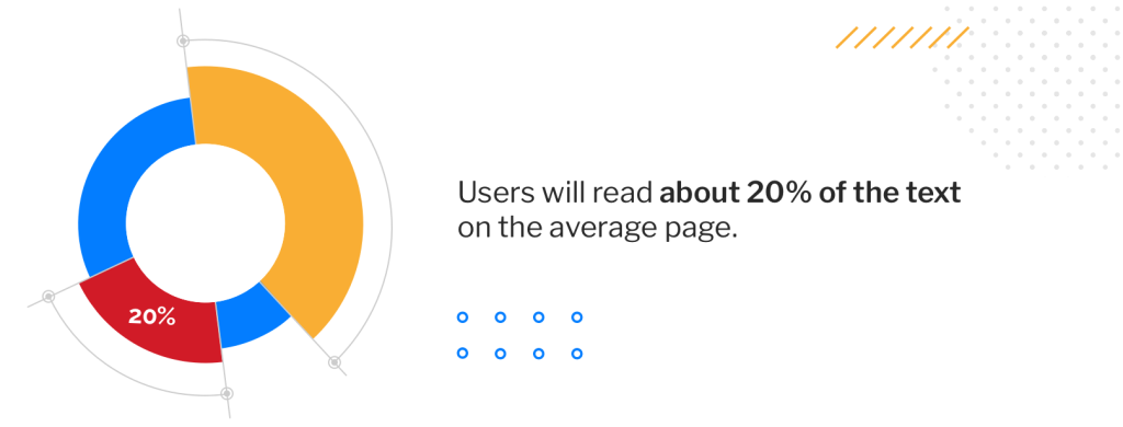
If your company’s website is full of information and different texts because “everything is important”, you should reconsider its content. Do the same with your marketing materials. If you are still not convinced, read once again about the UX design principles.
We live in a digital world
Secondly, we live in a digital world. According to “Digital 2022” and its latest report, global Internet users have climbed to 4.95 billion at the start of 2022, and 62.5% of the world population uses the Internet. An average user spends 4 h 58 min a day using the Internet.
We are accustomed to using mobile devices and looking at their screens. Every day we spend 4 h 48 min using smartphones, 4.62 billion people use social media, 58.4% of Internet users buy products or services online, and 24.6% compare prices.
If users spend so much time online, and in front of screens of mobile devices, they expect all products and services to be intuitive. Recent research conducted by Microsoft company shows that users can focus their attention only for 8 seconds.
We discover the world through all senses
Thirdly, even if our ability to stay focused is restricted to several seconds, we discover the world through all senses.
As we read in the article “Colors Strengthen the Perspective” in the magazine “Perspective”, we process 83% of the information through our sense of sight, 11% – through hearing, 3.5% – through smell, 1.5% – through touch, and 1% – through taste.
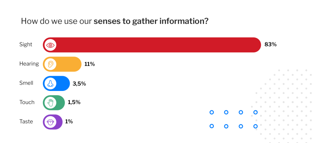
This would explain why customers pay attention to visual design and this aspect of products and services.
The visual language of your products or services is crucial because, as we have already mentioned on our blog, we remember:
- 90 % of what we said about what we do,
- 70 % of what we said during the interview,
- 50 % of what we saw and heard,
- 30 % of what we saw,
- 20 % of what we heard,
- 10 % of what we read.
Therefore, it is so important to conduct an engaging meeting with a client without a lot of unnecessary documents and marketing brochures. A modern meeting with a customer should be interactive and take all aspects described in this article into account. If you want your product or service to be attractive, you cannot forget about UX design and user experience.
How can Salesbook help you with sales?
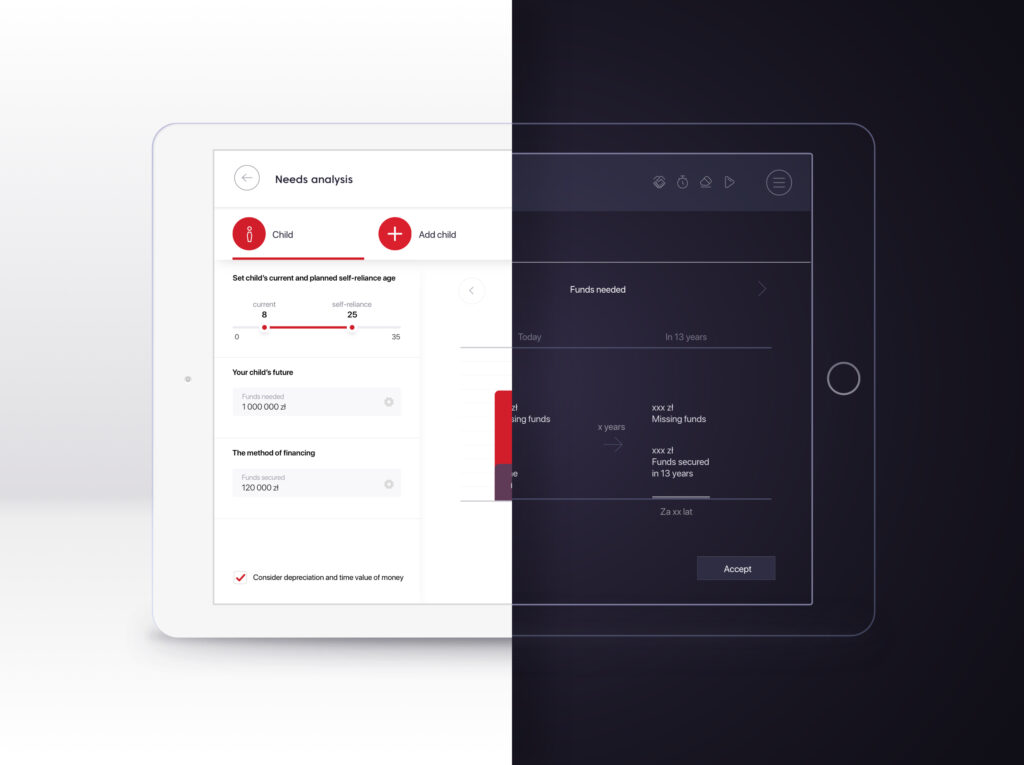
Salesbook is a modern tool that teams up with UX design and takes user experience into account. Thanks to this, your customer can focus on important elements during a meeting. A sales rep can use Salesbook at the same time and it is not demanding, even if the sales rep does not have a lot of experience in using a tablet at work.
Salesbook is intuitive and allows you to upload all necessary materials needed during a sales meeting.

Salesbook is a professional salesperson’s assistant that takes care of customer experience at different stages.
How can sales be effective with Salesbook?
- You take care of a language of communication with your customer – thanks to an app from Salesbook, you can inform your customers about your products or services and tell them about prices, parameters, or available configurations.
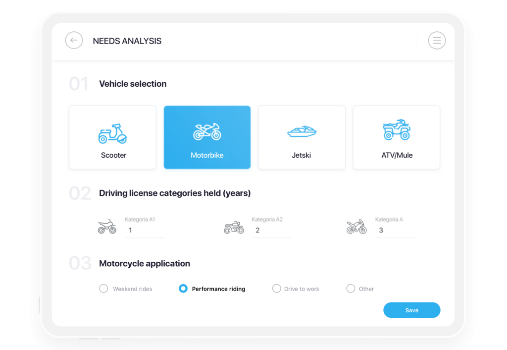
- You give a visually attractive presentation – you can upload videos, pictures, 3D models, and other materials that will convince your customer and affect a given person’s experience. Thanks to the app and UX design, you can draw your client’s attention from the beginning.
- A user interacts with Salesbook and you – if you use Salesbook and hold a tablet, your customer can interact with the app and ask you questions about products. Moreover, you can present an interesting offer or even its several options. You can also compare offers from other companies.
- You use colors and graphs – customers want to know hard data, and thanks to the app, you can present data graphically with different colors and graphs. Salesbook always follows the rules of UX design.
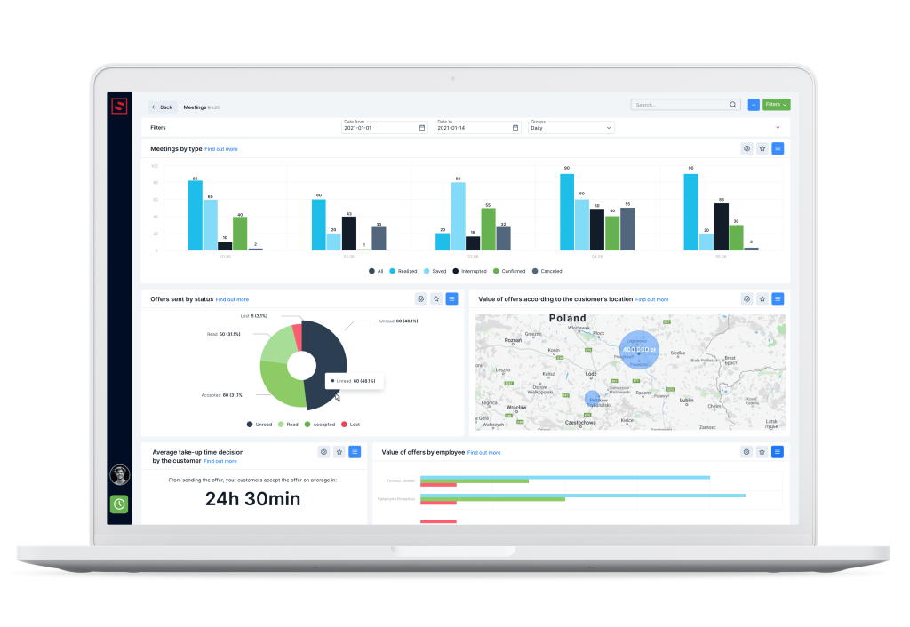
- You can modify the content in Salesbook and tailor it to your customer’s needs – you can change colors, upload logos, and other elements to personalize Salesbook and build your brand image. You can also add your own texts to show products that you want to sell in the first place.
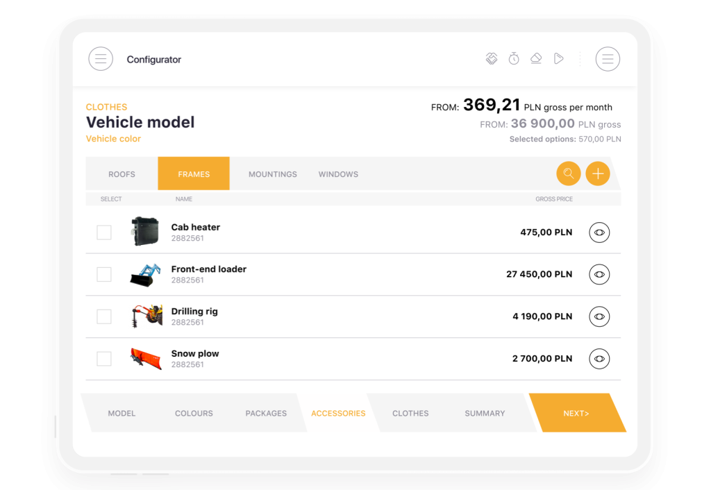
- Thanks to icons, you will reach your customer faster – as we have mentioned discussing UX design and senses – it is easier for people to remember what they see than they hear, and they do not like reading too many words. Salesbook uses icons to solve such problems. Furthermore, the app allows you to upload your own set of icons. The icons in the main menu have short inscriptions and the icons of the guide menu are in the upper right corner.
Summary
Salesbook is the app that helps you attract your customers’ attention and keeps it for longer. Thanks to UX design, clients can take part in compelling sales meetings and thanks to interaction design, they have a better experience with sales reps and your offer.
Watching videos, modern 3D models, or colorful graphs makes clients more engaged in a sales conversation.
Get to know Salesbook
If you want to know how Salesbook works during a sales meeting, try the free demo.
Table of Contents


