


Typography in business presentation. Can it generate revenue?


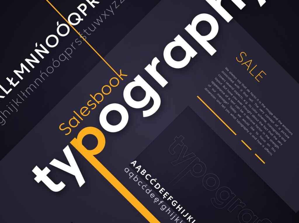
We always say that de facto it is the image and the emotions associated with it that sell. The very concept of a picture covers several aspects, e.g. its color scheme, iconography and layout. But have you ever thought about the fact that the very appearance of a text can be a decisive factor in the strength of our message? Today we would like to focus on this dimension and tell you what typography is and how it affects us.
Brief history of writing
In the beginning there was a word – a phoneme – the basic and primary sound, which over time became a graph – a unit of writing, a voice written graphically. Writing has evolved over the course of the millennia, creating many varieties and richness of visual form, matching the verbal message.
The first attempts to transform speech into a picture took place in prehistory. Our ancestors used the language of primitive rock drawings to express thoughts and convey emotions. In antiquity, more sophisticated systems were developed – the first of which was the cuneiform written by the Sumerians – and is considered the oldest writing in the world today.
The next stage in the development of writing (not yet typography) were the Egyptian hieroglyphs – this extremely elaborate and complicated writing, like the cuneiform, was based on a set of signs and symbols expressing certain concepts.
The known alphabetical writing was developed in Phoenicia over 3 thousand years ago, but the system we use to this day comes from ancient Rome and came to Poland with the adoption of Christianity by Mieszko I.
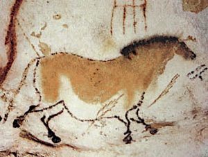
Source: https://pl.wikipedia.org/wiki/Lascaux_(Akwitania)
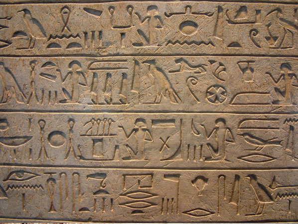
Source: https://pl.wikipedia.org/wiki/Pisma_egipskie
When did the typography started to show up? The concept of typography as a field dealing with shaping the visual dimension of language did not appear until the 15th century, when Gutenberg invented printing. However, the earlier principles of lettering, an effort cultivated mainly in medieval monasteries, had a significant impact on the development of typography today.
An example of this is the 15th-century copy of Thomas of Cantimpré (1201-1272) “Liber de natura rerum” – the composition of the elements on the pages of the book from the 15th century resembles the layout of a modern internet portal.
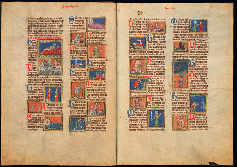
Source: https://www.gnm.de/fileadmin/editorCMS/objekte/objekt411_bild1.jpg
Contemporary typography
The 20th century was a time of change and experimentation – it gave typography new directions that changed the design and thinking about this field of art. Typography became an important tool in the world of visual communication.
Futurism
The first important event that changed the meaning of typography was the manifesto of the Futurists at the beginning of the 20th century. As an artistic movement, Futurism praised speed, machines and new technologies. Futuristic typography was characterized by dynamism and visual “emotionalism with quivering”.
They were primarily interested in the graphic form of the message, which was the most important. Even grammatical errors were allowed.
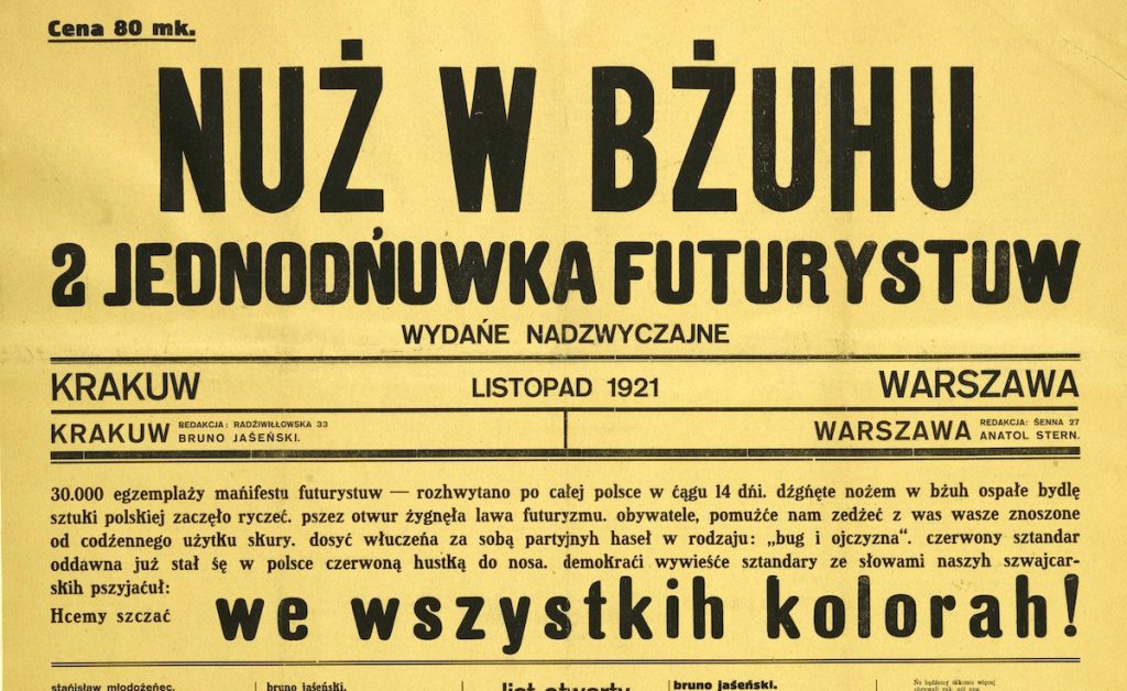
Nuż w bżuhu. – A oneday futuristic book (with grammatical errors) published in Krakow, 1921.
Source: http://czytelniczy.pl/wp-content/uploads/2017/04/jednodniowka.jpg
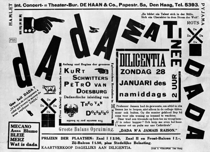
Dadaism
Simultaneously with futurism, the dada movement developed, which was governed by a case resulting from playing with the form. The related experiments with matter and composition gave new results of text and letter – all thanks to chance and creative intuition.
Dadaism also interfered with the typography and composition of catalogues and books, introduced new ways of breaking and selecting fonts, which were often accidental and unconventional.
Source: https://pl.wikipedia.org/wiki/Dadaizm
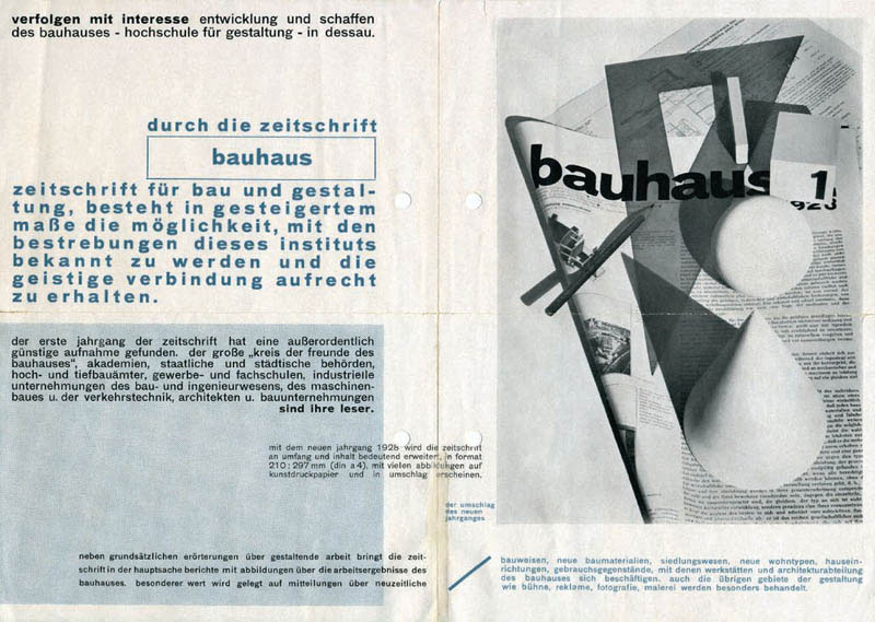
Bauhaus
In opposition to lose play and experiments with typography, trends such as Constructivism, Bauhaus, De Stijl, or later Swiss style were created. Functionalism, utilitarian approach and a new kind of dialogue between art and applied design, influenced the birth of a new typography.
Fragments of the text were based primarily on the visual and semantic hierarchy of importance. Both transparency and functionality giving typographic clarity were important for designers. The designers preferred typefaces without sheriff, considering the sheriff an additional decoration and unnecessary ornament.
Second half of the 20th century
This period has become a field for the development of new, dynamic cultural forms, especially those that cut off from social or political frameworks and principles. Among other things, subculture was created, i.e. punk typography, inspired by Dadaist pessimism, aggressiveness and dynamics of forms.
The designers focused on changing the form of visual communication, which coincided with the advent of the digital age, becoming a challenge to the accepted standards of readability. Graphic design mastered the concept of deconstruction and typographic experiments became a standard – the end of the old typographic world came.
The designers focused on changing the form of visual communication, which coincided with the advent of the digital age, becoming a challenge to the accepted standards of readability.
Typography in digital space
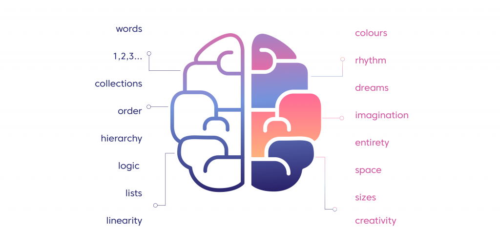
The designers consciously use the way typography engages both brain hemispheres, combining not only shape and color, but also creating a hierarchy and determining the structure of the information transmitted.
Appropriate choice of font type, its size, color or even free space influences the recipient’s subconscious, triggering intended emotions and inducing certain actions.
Behind contemporary typography there is no longer the text itself, but an extensive information infrastructure.
How we perceive the same information depends on many factors. Below is a simple example of how the choice of typeface, color and size of elements influences our feelings. Which of the following subtitles brings to mind security and stability, and which one is associated with dynamism and youth subculture?
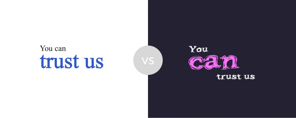
As Wim Crouwel wrote, “typography is creating order”.
In digital design, concepts such as navigation, usability, dynamics and accessibility become a priority for the designer. That is why it is so important to maintain good readability of the text – in practice this means proposing such an arrangement so that the recipient can find the necessary information quickly and without problems.
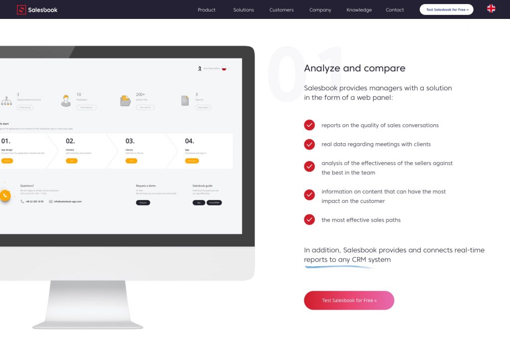
Typographical layout with Salesbook page as an example
On one of the Salesbook subpages we see a common two-column layout. On the left, the user can see attractive graphics – visualization of the content on the right.
Another thing that is striking is the large header: “Analyze and compare” – the short description below introduces the reader to the content of the paragraph. The light grey number on the back suggests that this is one of many solutions offered by Salesbook. The designer then applied bullet points – we have a graphic presentation of the task performed – the “check” icon on a red background.
Below is a summary text – it is worth noting that it is in the same style as the introduction to the paragraph, creating a graphical closure for the content. In addition, some of the content has been given a blue emphasis – its style is reminiscent of a marker on paper. The blue color of the underlining refers to the technical aspects of the application.
The last element on the view is a large red button “Test Salesbook for free” – red focuses the eye and stimulates action, encouraging the user to try out a modern solution, which Salesbook is.
Use typography in your messages
Typography can be one of the most important features of your message, including that of sales. If you play with the layout and choose the right typeface, you can influence how the recipients (customers) will perceive your offer, your company and you. The typography will allow you to control their emotions.
Table of Contents


